Simple Yet Powerful Formats that Make Your Online Training Engaging
Here's why you don't need complex authoring tools to make your learning engaging


Or why you don't need complex authoring tools to make your learning engaging.
Introduction
The content for this cheat sheet was prepared by Edera – the best online education studio in Ukraine with a strong and powerful RnD team. Since 2021, EdEra has been using Workademy to create and distribute online courses. Only in 2023 has EdEra created 20+ courses that over 160 thousand learners have attended. The RnD team of EdEra prepared some tips and tricks on using simple formats like bullet lists or expandable sections for highlighting different types of information. But let's start with some theoretical knowledge about visual clarity in e-learning!
Visual clarity
Visual clarity measures how effectively visual design defines priorities and conveys information.
Thanos Dimitrou - product designer
- Online courses developed based on the principles of visual clarity enable people to have a more enjoyable learning experience compared to those who disregard it;
- The quantity of visual elements (stimuli) positively correlates with perceived complexity. Therefore, the more visual elements there are, the more challenging it is for the brain to process them;
- The quantity of visual elements negatively correlates with perceived aesthetics. This means that the fewer visual stimuli there are, the more people tend to enjoy viewing the content of an online course;
- Aesthetic appearance influences the practical application of knowledge
Basic principles of visual clarity in e-learning
- Choose familiar and understandable fonts, colors, and designs for students - this reduces the time the brain takes to process information.
- Make your images, tables, and texts symmetrical to each other and the page layout (people prefer symmetry over asymmetry).
- Make objects in the foreground clear and more contrasting against the background. This facilitates image processing and makes text more readable.
- Less text is better. If the text can be conveyed in a diagram, table, or visually highlighted, among others - do it!
And remember – Easy to Read = Easy to Do!
Formats of content in Workademy
Here are the formats available in Workademy:
- Rich text and HTML/CSS code
- Image/Video/Audio and Text
- Accordions
- Dialog simulations
- Branching for scenario-based learning
- Highlighted sections for important and additional information and examples
- Buttons
- Questions
- Grid of images and text
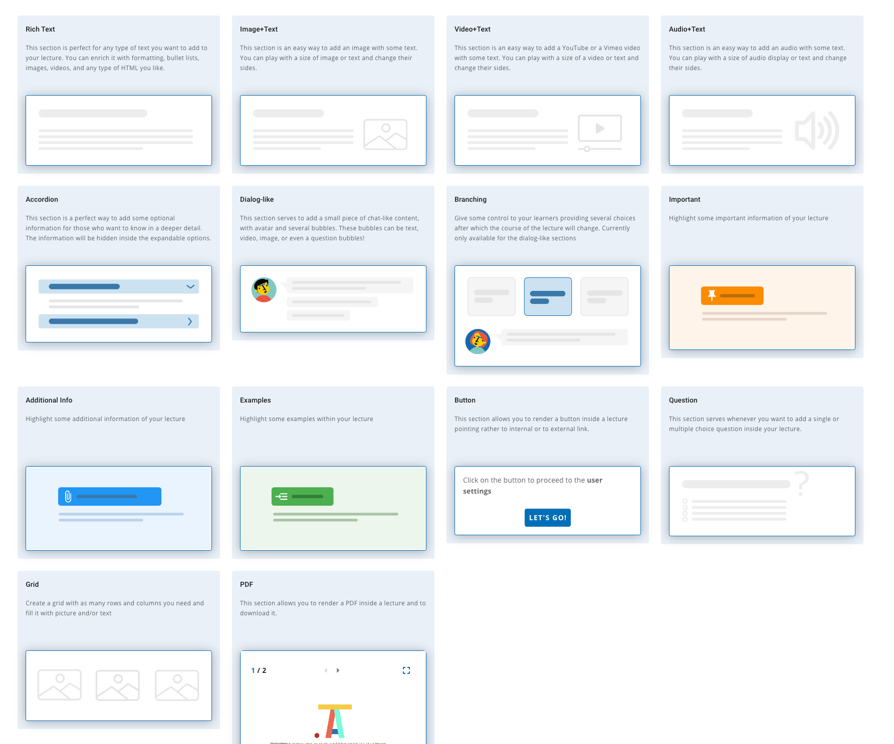
Let's see how you can use these formats to build great, engaging online training programs and courses.
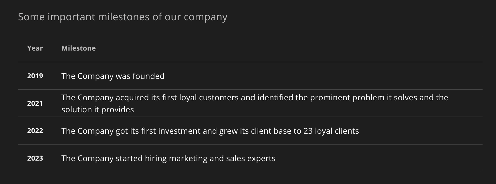
Using Tables
When to use?
- For visualizing the chronology of events/phenomena
- to make each of the points more prominent
- For visualizing categories of concepts.
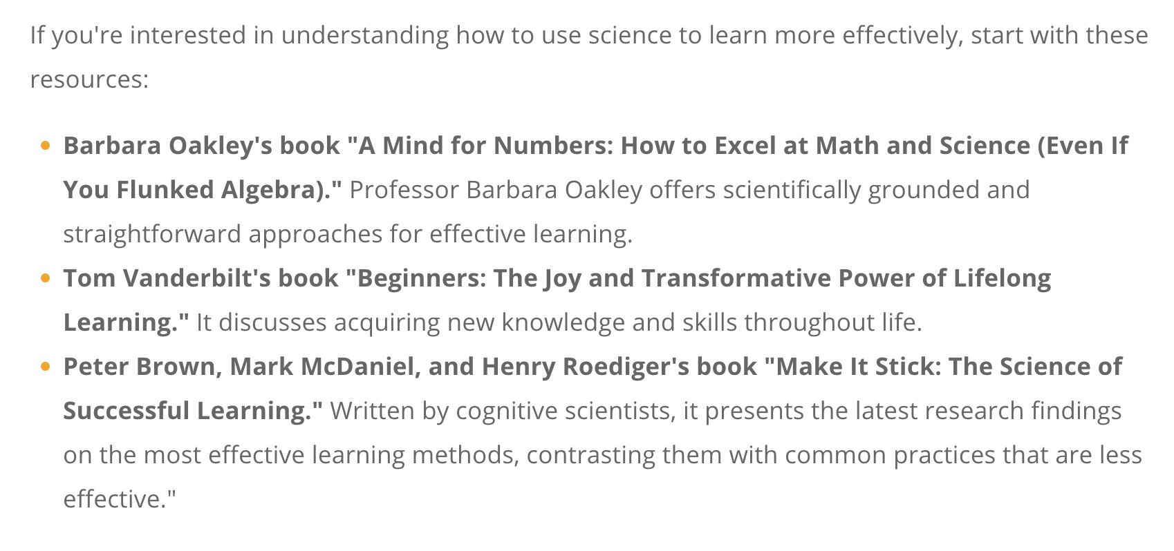
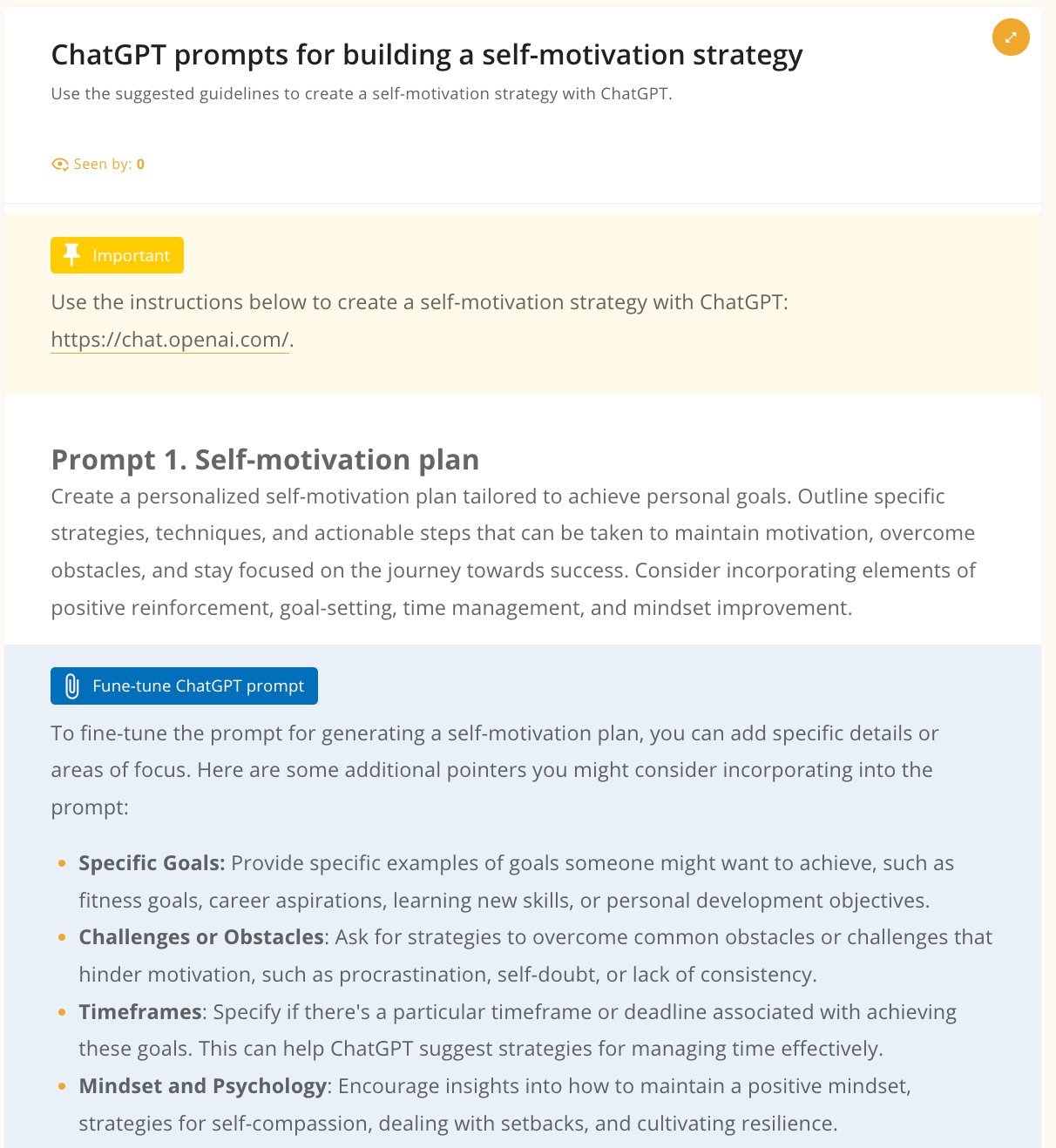
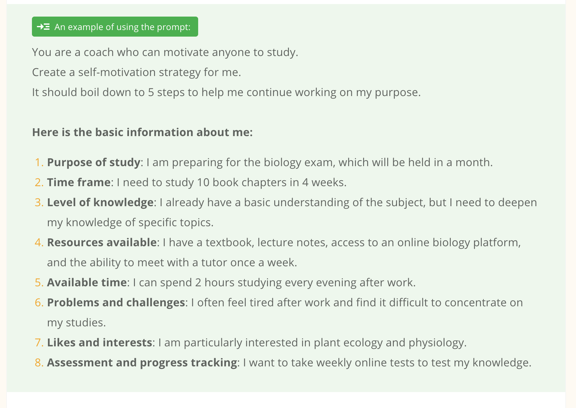
Bullets and numbering
When to use?
- For listing key terms/concepts/lists
- For visualizing sequences
- For instructions
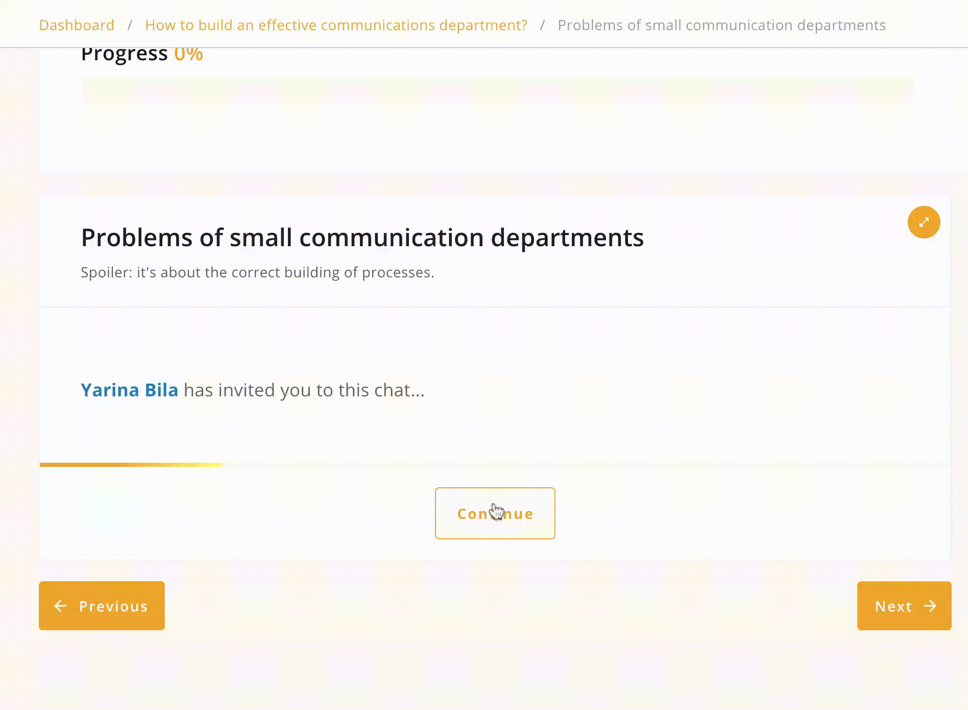
Accordion or list buttons
When to use:
When there is a need to add a lot of textual explanations of tools, phenomena, and concepts.
Link button

When to Use?
For downloading important documents (summaries, attachments) For linking to an external resource (company website, research)
Important, additional information, examples
When to use?
- When there is a lot of text to visually separate information blocks (between lectures)
- When it's necessary to 'highlight' important information within a block
Visualization of examples
When to use?
- When there are several text blocks next to each other, visually separate the information from one block so that it does not "mix into a single canvas"
- To show a usage example, instructions, etc
Interactivity (branching, dialogue simulations, questions)
When to use?
- If you need to get more attention from the learners and add interaction
- To "dilute" the basic format and add interactivity
- Where the course concept is based on dialogues and/or scenarios
- For questions at the end of the unit to engage the audience
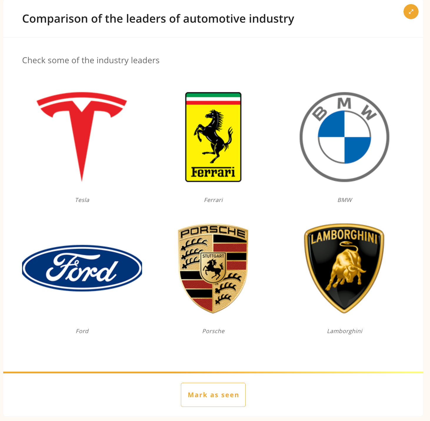
Grid (image/text)
When to use?
To add multiple images for quizzes, concepts, or comparisons:
Summary
It is possible to create a clean and engaging experience using simple text and image-based formats. With complex situations and budget cuts, there's no need for expensive authoring tools. You can do everything using the WYSIWYG built-in editors avialable in most modern LMSs.
Do want to learn how to use Workademy LMS to build engaging online training programs for your team members? Schedule a call with us.